
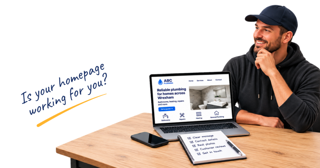
Your homepage doesn’t need to explain every last detail about your business.
But it does need to answer a few basic questions.
When a potential customer lands on your website, they’re probably trying to work out:
- Do you do the job they need?
- Do you cover their area?
- Do you look like someone they can trust?
- What does your work look like?
- How do they get in touch?
They shouldn’t have to dig around your website to find the answers.
Open your own homepage on your phone while you read through these five common mistakes. You might spot a few easy improvements you can make straight away.
1. Your headline doesn’t tell people what you actually do
“Quality solutions you can trust.”
Sounds nice enough.
But what does the business actually do?
It could be a plumber. It could be an accountant. It could be someone selling industrial floor cleaner.
The first part of your homepage should make it clear what your business does, and usually give the customer some idea of where you work too.
For example:
“Domestic Electrician in Shrewsbury & Surrounding Areas”
Or:
“Driveways, Patios & Landscaping Across West Yorkshire”
It doesn’t have to follow an exact formula. In fact, trying to squeeze every service and location into one headline can make it harder to read.
The test is much easier than that.
Look at the top of your homepage without scrolling. If someone had never heard of your business before, would they know what you do and roughly where you work?
If not, start there.
2. People have to hunt for a way to contact you
Someone has found your website, looked at your work and decided they’d like to ask for a quote.
Great.
Now where’s your phone number?
If they’re opening menus, scrolling to the bottom of the page or hunting around for a contact page, you’re making the next bit harder than it needs to be.
Give people an obvious way to contact you near the top of the homepage.
That could be:
- a phone number
- a Request a Quote button
- a short enquiry form
- online booking
Which ones you use will depend on your business.
An emergency plumber might want their phone number front and centre. A landscaper quoting larger projects might prefer customers to complete an enquiry form first.
And if you display your phone number, make sure people visiting on a mobile can tap it to call you.
Try it yourself.
Open your homepage on your phone and pretend you’re a customer. How quickly can you find a way to contact the business?
3. You’re not showing enough of your real work
One of the big advantages a trade business has is that you’ve usually got something real to show.
So show it.
Good photos can help a potential customer see the standard of your work and get a better idea of the business they’re thinking about contacting.
Depending on your trade, useful photos could include:
- completed jobs
- before and after photos
- work in progress
- you or your team
- your van
- details you’re particularly proud of
You don’t need to arrange a professional photoshoot every time you finish a bathroom.
A decent phone photo can be perfectly good for your website. Clear the rubbish out of the shot, wipe your camera lens, think about what’s in the background and take a few photos before you leave.
Stock photography can still be useful in the right places. The problem comes when a website is full of generic photos and gives customers no opportunity to see the business or its actual work.
Not sure which photos are worth taking?
My free Job Photo Checklist for Trades gives you a quick list you can save to your phone and use on your next job.
4. You’re hiding the proof that you’re good at what you do
Telling people you’re reliable, experienced and professional is one thing.
Showing them is much more useful.
Have a look at your homepage. What can a new customer actually see that helps them feel comfortable getting in touch?
Depending on your business, that might include:
- genuine customer reviews
- photos of completed work
- relevant trade registrations or accreditations
- how long you’ve been working in the trade
- guarantees you offer
- insurance details where they’re relevant
You don’t need to plaster every badge you’ve ever earned across the top of the website.
Choose the things that genuinely matter to your customers and make them easy to find.
Reviews are particularly useful because they let previous customers talk about their experience in their own words. If you’ve already got some good reviews sitting on Google, don’t hide all of them away on a separate reviews page.
Bring a selection onto the homepage where people will actually see them.
5. There’s no obvious next step
A customer has worked out that you offer the service they need.
They cover your area.
They’ve seen your work, read a couple of reviews and think you could be right for the job.
What do you want them to do now?
Your homepage should make that obvious.
That doesn’t mean every trade website needs the same button.
Your next step might be:
→ Call for a quote
→ Request a quote
→ Send an enquiry
→ Message us on WhatsApp
→ Book online
Or you might want someone to look at a particular service before getting in touch.
Think about how you actually want new enquiries to come into the business, then make that route easy to follow.
Don’t make your customer work it out for themselves.
Give your homepage the 10-second test
Open your homepage on your phone.
Now give yourself 10 seconds and look at it as though you’ve never seen the business before.
Can you tell:
- What does the business do?
- Where does it work?
- Why would you trust it?
- What does the work look like?
- What should you do next?
If you can answer all five without much effort, your homepage is doing a decent job.
If you struggled with one or two, you’ve now got somewhere to start.
And if your homepage passed the test, the next step is checking the rest of your website.
I’ve put together a free 7-Point Website Check for Trades that walks you through seven quick checks you can make on your own website.
No technical website knowledge needed. Open your site, work through the checks and see what you find.