These days, if you’re not showing up online, you’re missing out. Whether you’re a plumber, electrician, plasterer or builder – people are Googling you before they call. And if your website doesn’t give them what they need fast, they’re off to the next one.
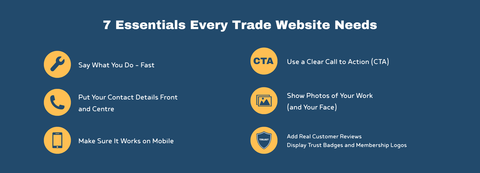
The good news? You don’t need a flash website. You just need one that gets the basics right. Here are fundamental website for tradespeople tips: 7 things every trade website needs to help you get more local work.
1. Say What You Do – Fast
“Make It Clear You’re a Plumber/Electrician/Builder in [Town]”
This isn’t just about chucking your job title on a page – it’s about making sure your website passes the grunt test.
The grunt test comes from the book Building a StoryBrand by Donald Miller (well worth a read if you’re serious about growing your business). It’s a simple idea: if someone lands on your website and could only grunt in response, would they understand what you do, who it’s for, and how it helps them? If not, your site is probably confusing people more than it’s converting them.
But we can go a step further than that. Every trade website should clearly answer these four things right at the top of the page:
- What is it you do?
- Who is it for?
- How will it make their life better?
- What should they do next?
Too many sites focus on the business – “we started in 1995”, “we offer a wide range of services”, “we take pride in our work” – but it’s all me, me, me. The customer doesn’t care about that upfront. They’re not looking for your CV – they want to know, straight away, can you help me with this problem I’ve got?
Instead of talking about yourself, talk to them – show them how you’ll make their life easier. Use clear, simple language that focuses on their needs.
Let’s say you’re a heating engineer. Instead of writing:
“Established in 2001, we offer heating solutions to suit your lifestyle needs.”
Say this:
- Gas Safe Engineer, offering boiler replacements, repairs and servicing in Wrexham, Cheshire and Flintshire.
Much clearer, right?
It tells them exactly what you do, what kind of jobs you take on, and where you work. No guesswork needed.
Here are a few more examples that follow the same format:
- NICEIC Approved Electrician – domestic and commercial work across Chester and North Wales.
- Bathroom Fitter in Wirral – full installs, plumbing and tiling included.
- Builder covering Flintshire & Cheshire – garage conversions, extensions and general building work.
This kind of wording not only helps people instantly understand if you’re the right person for the job, it also gives Google useful info to help you show up in local searches. It’s one of the simplest but most important bits of copy on your whole site.
Avoid the Jargon
It’s also worth saying – lose the technical terms. You might know what “unvented cylinder installation” means, but the average person doesn’t. Same goes for “full heating system powerflush” or “RCBO protection”.
Instead of listing a bunch of services full of trade speak, explain things in plain English. Here’s a few examples:
- Instead of “Powerflush” → say “We clean out your radiators and pipework to help your heating run better and save money.”
- Instead of “Unvented cylinder” → try “We fit modern hot water systems that give you better pressure at your taps and shower.”
- Instead of “RCBOs” → say “We install up-to-date safety switches to protect your home’s electrics.”
A good test is this: would your nan understand what you’ve written? If not, simplify it. Your website isn’t for other trades – it’s for everyday people who just want to know if you can help, and what to do next.
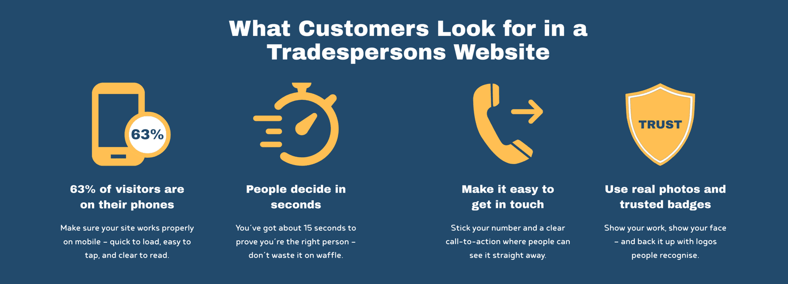
2. Put Your Contact Details Front and Centre
“If They Can’t Call You, You Won’t Get The Job”
You’d be amazed how many trades websites bury the most important bit – the contact info. It’s like locking your front door and hiding the key in a hedge. Most people visiting your site aren’t there for a browse. They just want to know if you can help and how to get hold of you.
We worked on a plumber’s site not long ago – brilliant at what he does, but his phone number? Hidden away on the contact page. We added it to the top of every page, stuck it in the footer, and made it clickable on mobile. Within a week, the calls started picking up.
Same goes for your email – don’t make people copy and paste it. A simple “click to email” link saves them the hassle and makes you look more professional. Stick it in your footer at the very least, and ideally somewhere near your phone number so people can choose how they want to get in touch.
And then there’s the contact form. If that’s the only way people can reach you – it’s not enough. Forms are vague and impersonal, and most people won’t bother unless there’s absolutely no other option. You’ll be lucky if they even leave a message. If you’re going to use a form, make sure:
- There’s a clear link to it on every page
- It’s not hidden behind a tiny “Contact” menu link
- You tell them how long they should expect to wait for a reply (e.g. “We usually respond within 24 hours”)
And don’t forget to mention where you work. A quick line like “Based in Mold – covering Flintshire, Denbighshire and surrounding areas” gives locals confidence and helps Google know when to show your site in searches.
The key here is simple: don’t make people think. Make it easy to call, easy to email, and if they do use a form – easy to know when they’ll hear back.
3. Make Sure It Works on Mobile
“Most People Are on Their Phones – Is Your Site Ready?”
Here’s the reality: around 63% of all website visits now happen on a mobile, compared to just 37% on desktop. That means nearly two-thirds of the people checking out your business are doing it on their phone – probably while stood in the kitchen, in the van, or mid-job trying to sort a tradesperson fast.
So your website absolutely has to look and work properly on a phone.
That means:
- It should load quickly (under 3 seconds is ideal)
- The text needs to be big enough to read without zooming
- Buttons must be easy to tap (especially with big thumbs)
- No pinching or scrolling sideways – just a clean, vertical flow
If your site doesn’t do these things, people won’t hang about. They’ll bounce off and try the next result in Google. And honestly, can you blame them?
I’ve seen loads of trade sites where you need a magnifying glass just to find the phone number. Or the buttons are so small you end up clicking the wrong one. That kind of thing loses you leads – and fast.
It’s Not Just About Looks – It’s About Google Too
Google’s watching. They know how your site performs on mobile, and if it’s not user-friendly, they’ll be less likely to show you in local search results. So this isn’t just about giving customers a good experience – it’s also about making sure they actually find you in the first place.
Making your site mobile-friendly doesn’t mean a full rebuild either. Often it’s just about better layout, clearer buttons, and quicker load speeds.
If you haven’t done it already, grab your phone and look at your site the way a customer would. If you find it annoying to use – chances are they will too.
4. Add Real Customer Reviews
“Social Proof Builds Trust Instantly”
When it comes to hiring someone for work in their home or business, people want to feel reassured. And nothing builds trust quicker than seeing that other locals have hired you – and had a good experience.
That’s where reviews come in.
We’re all the same – before booking a holiday, buying a tool, or trying a new takeaway, we check the reviews. Your customers are doing the exact same thing with you. They want to know:
- Are you reliable?
- Do you turn up when you say you will?
- Is your work tidy and solid?
So if you’ve got good reviews sitting on Google, Checkatrade, Trustpilot or Facebook – show them off. Don’t make people go looking. Pull a few onto your website and make them easy to spot.
What Makes a Review Actually Work?
It’s not just the words – it’s the detail. A proper review doesn’t need to be long, but it should feel real.
Good example:
“Had a new boiler fitted by Dave in Mold. Great service, turned up on time and left the place spotless. Highly recommend.” – Sarah, CH7
Why this works:
- It names the service (boiler fitting)
- It gives a location (Mold)
- It uses natural, specific language
- It’s clearly written by a real person
If you can, add:
- Their first name (or full if they’re happy)
- The area or postcode
- A star rating
- A photo of the job (if relevant)
These small touches make reviews feel more genuine – and more persuasive.
Real Over Perfect
Don’t worry about having dozens of reviews or making them sound polished. One or two honest, local reviews can do more for your reputation than any bit of fancy web design.
I did a website for a plasterer recently who had hundreds of brilliant reviews on Facebook – seriously, pages and pages of them. But not a single one was on his website. So we pulled a handful of the best ones in and added direct links back to his Facebook reviews. That way, people could click and see they were genuine. It made the site feel 10 times more trustworthy – and he started getting more enquiries almost straight away.
If you do this, just make sure those links open in a new tab. You don’t want to send people away from your website – it’s about adding trust, not losing visitors.
And if you’re just starting out and don’t have many yet? Ask your best clients. Most people are happy to leave a review – they just need a nudge and a direct link to where they can do it.
You could even follow up with a message like:
“Thanks again for choosing us – if you’ve got 30 seconds, would you mind leaving a quick review here? It really helps us out.”
5. Use a Clear Call to Action (CTA)
“Tell People What to Do Next”
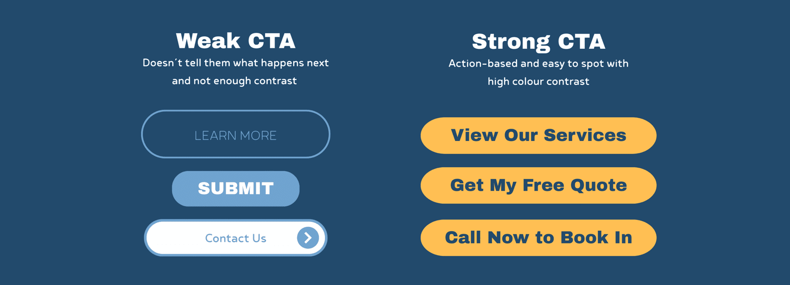
This is one of those things that sounds obvious – but loads of websites miss it. Someone’s read about your service, seen the pictures of your work, even read a couple of glowing reviews… and then what?
If there’s no clear next step, they might just click off. That’s a wasted lead.
Your website should guide people to take action. You don’t need anything complicated – just a clear, simple line that says what to do next. That’s what we call a call to action or CTA.
Something like:
- “Call now for a free quote”
- “Message us to check availability”
- “Get a fast response – click here to contact us”
It doesn’t need to be clever or long. Just direct, and easy to spot.
Use Buttons – and Use Them Often
Don’t rely on people scrolling all the way down to the bottom of a page to get in touch. Stick a call-to-action button near the top, and after each main section if you can. That way, wherever they are on the page, there’s always a nudge to get in touch.
And make your buttons stand out. Not grey. Not hidden in the background. Bold, clear colours with action words.
Example:
[Call Now]
[Get a Quote]
[Book a Visit]
It’s also worth keeping your wording focused on the benefit for them. So instead of saying:
“Submit Form”
Say:
“Get Your Quote” or
“Request a Callback”
It’s a small difference, but it feels more human and less like a formality.
Don’t Leave Them Guessing
The main thing is – don’t assume people will figure it out on their own. Your website isn’t just a business card, it’s your online salesperson. And like any good salesperson, it should always end with, “So, shall we get you booked in?”
6. Show Photos of Your Work (and Your Face)
“A Picture Says You’re Legit and Take Pride in What You Do”
Photos are one of the fastest ways to build trust. Whether it’s a finished bathroom, a neatly installed fuse board, or just a quick snap of you on the job – real images help people feel like they know who they’re dealing with.
And that’s the key: people buy from people.
If your website is full of generic stock images, it might look “clean”, but it doesn’t feel real. Customers want to see you, your team, and your actual work. It shows you’re local, hands-on, and proud of what you do.
That doesn’t mean you need to hire a professional photographer (although if you can, great). Just get a few decent shots with your phone in good lighting:
- You or your team working on a job
- Before and after shots of a finished project
- A quick group photo or selfie on site
- Van signage or uniforms with your logo
Real Photos Build Real Trust
I always advise trades to avoid relying on stock photos for anything to do with their own work. It’s misleading – and if someone sees the same image on another site, your credibility’s gone.
Stock images are fine as placeholders when a site’s being built, but they should always be swapped out for the real thing.
As for showing yourself or your team – it might feel a bit awkward at first, but trust me, it works. Customers want to know who’s coming to their home. A friendly face on your website helps break the ice before they’ve even called you.
It’s like when you get a quote from two different firms – one has a clean website with real jobs and real people, the other has a bunch of stock photos and no names. Who do you trust more?
Keep It Tidy
When showing off your work, focus on the finish. A quick photo of a freshly plastered wall, a new boiler install, or a fitted kitchen says a lot – especially if it looks neat and professional.
A few tips:
- Add a short caption (e.g. “New consumer unit fitted in Flint”)
- Use 1–3 images per job – no need to overdo it
- Add “alt text” with your service and location (helps with SEO)
And again – it doesn’t have to be perfect. It just needs to be real.
7. Display Trust Badges and Membership Logos
“Let the Logos Speak for You”
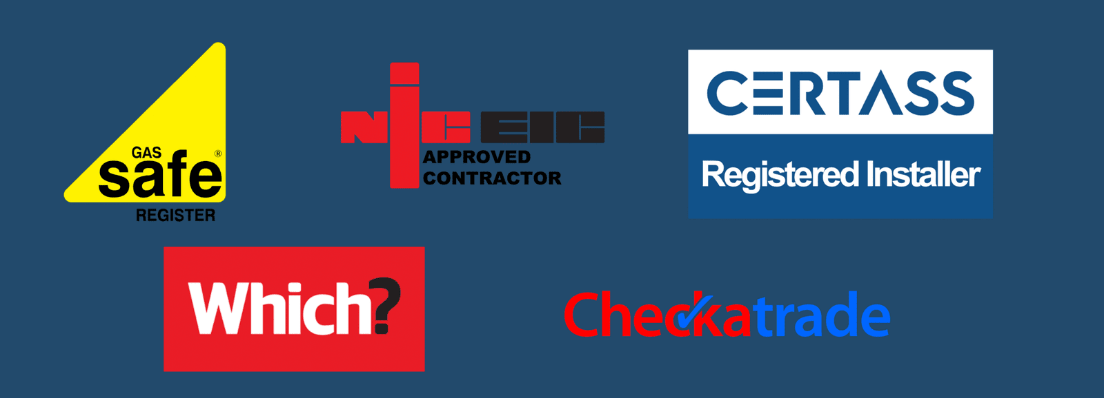
Trust badges aren’t just decoration – they’re instant credibility. In a world where cowboy builders and rogue traders give everyone a bad name, having recognised logos on your site helps show you’re a professional.
These badges act like silent salespeople. Customers might not know the ins and outs of every scheme, but if they see a Gas Safe or Checkatrade logo, they instantly feel more at ease.
We worked with a heating engineers who was Gas Safe and Oftec registered but buried the trust mark in a tiny footer. We pulled it up to the homepage and gave it pride of place near the reviews. Just doing that gave the site more weight – and more importantly, it reassured visitors from the off.
So what should you include?
- Gas Safe (heating engineers)
- NICEIC / NAPIT (electricians)
- Checkatrade, Trustpilot, or MyBuilder
- TrustMark (broad coverage across trades)
- FENSA (window fitters)
- Velux Certified Installer (roofers)
- Any manufacturer-approved installer logos
- Public liability insurance icons
But here’s the key – only show logos you’ve actually earned. Don’t slap on badges for show. Link each one to your official listing if you can, and make sure it opens in a new tab so visitors stay on your site.
Even something simple like a small line that says “Fully insured and trusted by hundreds of local customers” next to those logos goes a long way.
And remember – you don’t need loads. One or two good ones in the right spot can do more than a full page of waffle.
Final Thoughts: Turn Website Visits Into Local Leads
Your website shouldn’t just sit there like a digital business card. It should do some of the heavy lifting – bringing in new leads, showing you’re legit, and making it easy for people to say: “Yep, I’ll give them a ring.”
Whether you’re a roofer in Glasgow, a plasterer in Leeds, a builder in Manchester or a window cleaner in Bristol – these 7 essentials work across the board.
Let’s quickly run through the must-haves:
- Say what you do and where you work – clearly and quickly.
- Make it dead easy to contact you – phone, email, form, the lot.
- Make sure it works on mobile – because most people are browsing on their phone.
- Show real reviews – let your past customers do the selling for you.
- Use clear calls to action – tell people what to do next.
- Show photos – not just of your work, but of you. People buy from people.
- Add trust badges and logos – they give instant credibility.
It’s not about having the flashiest website. It’s about having one that does the job – fast, clear, and confident.
If you’ve made it this far and you’re thinking your site might need a few tweaks- you’re probably right. And that’s what I’m here for.
Want a hand getting it sorted?
I offer quick, honest website reviews for trades. No pressure, no bull – just straight-up advice on what’s working and what’s not.
Drop me a message and I’ll take a look.
This is exactly the kind of stuff we talk about in my free Facebook group: real-world tips to help UK trades get more work online – without wasting money on shiny crap you don’t need.
Come join us → Behind the Tools Facebook Group