Strong branding is not just for big companies. It helps sole traders and small teams win better jobs, earn trust faster, and charge fair prices with confidence. In a busy local market, the right brand cuts through noise and tells customers exactly why they should pick you. This guide gives you the practical steps to build a clear, credible brand that works across your Website for Tradespeople, your vans, uniforms, quotes and every message you send.
We will cover brand purpose, audience, values, name and tagline, colours and fonts, logo and visual assets, brand voice, and how to apply everything consistently in real life. If you want a site that makes your brand look sharp from day one, our Starter website is £19 per month with hosting and business email included. You send the content, we set it up quickly so you can get back to the tools. See the Starter plan or compare plans
.
Start with purpose and audience
A brand is a promise. Your purpose is the helpful outcome you deliver for a specific type of customer. Get this clear and all other choices become easier.
Questions to answer:
- Who do you help most often. Busy homeowners, landlords, small commercial sites, letting agents.
- What result do they want. Safe electrics, a warm home, a dry roof, a tidy garden, a bath tap that doesn’t drip.
- What pain do you remove. Missed appointments, unclear pricing, poor communication, mess, slow response.
Write a one line purpose:
- “We help busy homeowners in Swindon keep heating safe and efficient with quick, tidy service.”
- “We upgrade old consumer units for homeowners who want safer electrics and a clear certificate the same day.”
- “We lay durable patios for families who want a clean, low maintenance garden that looks great all year.”
This line guides your Tradesman Website Design, your quotes, your social posts and how you answer the phone. Put it at the top of your home page hero section and repeat it on your about page.
Identify core values and differentiators
Values are the behaviours you commit to. Differentiators are the visible things that make you the easy choice. Keep both practical and provable.
Pick three values you can live by:
- Clear communication. Call ahead and give tidy updates.
- Respect for the home. Shoe covers, dust sheets, full clean up.
- Reliable timing. Narrow arrival windows and realistic lead times.
List your differentiators:
- Trade body membership and registration number.
- Price guidance before start the job.
- Neat finishing as standard. Before and after photos to prove it.
- Specialism in a profitable niche. For example EV charger installs, boiler swaps, consumer unit upgrades, resin bound driveways, loft boarding.
Use these as proof points on your trades websites. Add them to your service pages, your About page, and your quote templates. If you measure anything useful, like response times or average review scores, publish the numbers.
Choose a business name, tagline and mission statement
You do not need a clever name. You need one that is easy to spell, easy to remember and easy to print on a van.
Business name tips:
- Keep it short. Under three words if possible.
- Include your trade or region if it helps. “Swindon Heating”, “Cotswold Carpentry”.
- Check the matching domain is available.
- Avoid names that lock you into a tiny niche unless you intend to stay there.
Tagline formula:
Trade plus benefit plus reassurance. Keep it under eight words.
- “Heating repairs, done right, first time.”
- “Safe electrics, tidy work, clear pricing.”
- “Patios that last, installed with care.”
Mission statement template:
“In [area], we help [audience] get [result] through [approach]. We promise [values], and we back it with [proof].”
- Example. “In Swindon and nearby towns, we help busy families get reliable heating through quick diagnostics and quality parts. We promise clear communication, tidy work and fair pricing, and we back it with Gas Safe registration and hundreds of five star reviews.”
Use the tagline near your logo. Use the mission on your About page and in proposal documents.
Select colours and fonts that signal trust
Colours and typography send a message before anyone reads a word. Pick a small set that looks professional across web and print.
Colour tips:
- Choose one primary colour and one neutral. For example deep blue plus light grey. Or dark green plus off white.
- Add one accent for buttons and highlights. Use it sparingly.
- Check contrast for readability. Dark text on a light background is safest.
- Test colours on a phone outside in daylight. If it is hard to read, adjust.
Font tips:
- Use one typeface for headings and one for body text. Two is enough.
- Sans serif fonts (the ones without the little feet) are clean and easy to read on screens. Examples include Inter, Poppins, and Roboto (the one I’m using).
- Keep body text between 16 and 18px for mobile legibility.
- Avoid novelty fonts. They age quickly and are hard to read.
We bake sensible defaults into our website templates, so your site starts clean and readable. You can always switch colours to match your vans and uniforms.
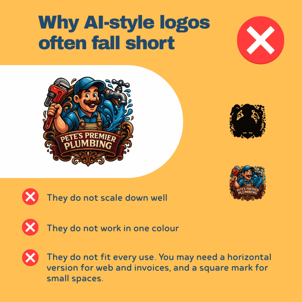
Create a simple, recognisable logo
You do not need complex artwork. Aim for a clean wordmark plus a small icon that works at any size.
Logo checklist:
- Works in one colour for print on vans and clothing.
- Looks sharp at small sizes on mobile.
- Has a square version for social profiles and favicons.
- Uses your chosen brand colours and fonts.
If budget is tight, start with a tidy wordmark. Add the icon later. Keep spacing consistent and set minimum sizes so no one stretches or squashes it.

Build consistent visual assets
Consistency builds recognition. Create a small set of assets and use them everywhere. Most of these can be made really quickly and easily in Canva for free.
Core assets to prepare:
- Social profile images and cover banners in correct dimensions.
- Email signature with logo, tagline, direct phone and links.
- Quote and invoice templates with the same header and footer.
- Vehicle livery mockup that matches your website style.
- Site photos with the same light, angle and simple backgrounds.
- Badge strip image with your accreditations and insurance.
Save everything in a shared folder. Label files clearly. Keep a short brand sheet with colours, fonts, logo rules and examples. If you are on our plans, we can host the brand sheet on your site for easy access by your team and suppliers. Contact me
Craft a brand voice that is friendly and expert
Your voice is how you sound in writing and speech. For trades, the best mix is warm, plain English and confident about the details.
Tone guidelines:
- Friendly but not chatty. Respect the customer’s time.
- Use everyday language. Avoid industry jargon. If you must use a technical term, explain it.
- Be specific. “We arrive within a one hour window” beats “We arrive promptly”.
- Show care for the home. Mention shoe covers, dust sheets and tidy finishes.
- Keep sentences short. Aim for clarity over flair.
Phrases that help:
- “Here is what will happen next.”
- “This is what the price includes.”
- “You will get a reminder the day before.”
- “We will leave the area clean and safe.”
Carry this voice into your website your quotes, your WhatsApp replies and your aftercare emails. It keeps trust high and avoids misunderstandings.
Apply your brand everywhere customers see you
A brand works when it is visible and consistent. Use the same colours, fonts, logo and voice across all touchpoints.
Website
Your website is the hub. Use your brand to create a clear structure with simple navigation, strong calls to action and real proof.
- Match colours and fonts across all pages.
- Use your tagline near the logo and in page footers.
- Keep buttons consistent. Same shape, same wording, same placement.
- Add a proof row. Trade logos, review stars, insurance, years in business.
- Use real photos of your team and work. Avoid stock where possible.
Need a tidy setup that puts this in place quickly. The Starter website is £19 per month and is built for conversion and clarity. Get started or see all options on the pricing page. More tips and downloads live here. Free stuff
Vans
Your van is a moving billboard. Keep it bold and readable from 10 metres.
- Large business name on both sides and the rear.
- Tagline under the name to explain what you do.
- Phone number and website in big, clear type.
- Use one or two colours, not five.
- Avoid clutter. White space improves legibility.
Uniforms and PPE
Uniforms send a signal of professionalism and safety.
- Simple logo on chest and back.
- Add a trust signal like Gas Safe logo if possible.
- Name badges for jobs where it helps.
- High visibility colours if the site requires it.
- Keep the palette the same as your site and vans.
Paperwork
Quotes, invoices and certificates should feel like part of the same family.
- Use the same header and footer on each document.
- Repeat your tagline and contact details.
- Keep terms in plain English with short paragraphs.
- Add a short aftercare note. For example boiler manuals, warranty info, safe isolation steps.
Social profiles and listings
- Use the same profile photo, cover image and bio everywhere.
- Make sure your name, address and phone match your website.
- Post before and after photos with short captions that name the town and service.
Consistency makes customers feel they are dealing with a careful, organised team. That is a quiet but powerful sales tool.
Bring branding into your SEO
Branding and SEO support each other. A clear brand helps people remember you and click your result when they see it again.
On your website:
- Use your business name and tagline in meta titles where it fits.
Example. “Boiler Service in Swindon | ABC Heating. Safe and tidy.” - Keep your logo file name and alt text meaningful.
Example. “abc-heating-logo-swindon.png” with alt text “ABC Heating Swindon logo”. - Add Local Business schema with your name, address, phone, opening hours and review rating.
On your Google Business Profile:
- Match your brand colours in photos and banners.
- Use the same voice in updates.
- Ask for reviews and respond to them in your brand tone.
If schema and meta sound like a headache, we handle the essentials as part of our Tradesman Website Design setup. Contact us
A simple brand kit you can finish this week
If you want a quick win, build a light brand kit and tick these items off.
- One line purpose and audience
- Three values and three differentiators
- Business name, domain and tagline
- Primary colour, neutral colour and one accent
- Heading font and body font with sizes
- Clean wordmark logo and square icon
- Email signature and quote template
- Van livery layout that matches your website
- Social profile images and cover banners
- Brand voice guidelines on one page with examples
Save this in a folder and share it with your team. Use it every time you make a page, a post or a piece of print.
Common branding mistakes to avoid
- Too many colours and fonts. Pick a small set and stick to it.
- Complicated logo. It should work in one colour and at small sizes.
- Vague promises. Replace “high quality” with a specific benefit and proof.
- Inconsistent details. Keep the same phone number, spacing and tone everywhere.
- Stock photos instead of real work. Show your team and your finishes.
How your brand feeds conversions
Good branding is not decoration. It improves conversion in practical ways.
- Clear colours and fonts improve readability, which keeps visitors on your pages longer.
- A direct tagline helps customers instantly feel “this is for me”.
- Consistency across website, van and uniform builds trust before you speak.
- A useful voice reduces back and forth and speeds up booking.
- Real photos and case studies support your value and reduce haggling.
If you want this to flow through a tidy site structure without hassle, the Starter site at £19 per month or one of our more supported packages gives you a clean base that matches your brand kit. Start here or browse all plans on the pricing page.
Example brand in action
Name: Cotswold Electrics
Tagline: Safe electrics, tidy work, clear pricing
Purpose: Help homeowners in Cirencester and nearby towns update and maintain safe electrics with minimal disruption
Values: Communication, respect for the home, punctuality
Differentiators: NICEIC approved, same day certificates, one hour arrival window
Colours: Deep blue, light grey, bright blue accent
Fonts: Inter for headings, system sans for body
Logo: Simple wordmark with a small plug icon
Voice: Friendly and expert, short sentences and no jargon
Application: Matching website, van livery with large phone number, navy polos with embroidered logo, quotes with the same header, social posts with before and afters plus the town named in the caption
This is simple to understand and simple to run. It is memorable because it is consistent.
Where to go next
- Draft your one line purpose and pick three values.
- Decide your colours, fonts and a clean wordmark.
- Update your website and paperwork to match.
- Book van graphics and order uniforms.
- Post one case study per week with tidy photos and a short caption.
When you are ready to put your brand into a site that brings in real enquiries, we can help. Our Starter website is £19 per month with hosting and business email included. It is designed for Websites for Tradespeople and supports the structure and trust signals that convert.
Many thanks for reading. If you would like help turning this brand kit into a live site or printed assets, send me a message and I will sort it.